篇一 :英语图表作文范文
How People Spent Their Holidays
As can be seen from the table, the past decade have witnessed dramatic changes in the way people spent their holiday between 1990 and 2000.In 1990, 63% of people spent their holidays at home, while the figure dropped considerably to 24% in 2000. It is obvious from the table that people tended to be more and more mobile, and they wanted to get entertainment in the outside world.
What contributed to these changes? I think the reasons are as follows. To start with, with the rapid development of economy, people earn by far more money than they used to. Thus, people are able to afford traveling expenses. Secondly, people think it important to get well-informed about the outside world in this new era when everything is on the move. Traveling, of course, is a sure way to achieve this goal. What's more, in this competitive society, people are usually under great stress. However, it is not difficult to find traveling an effective way to relieve people's stress and get relaxation. Last but not least, by traveling outside, people are close to nature, which is not only beneficial to both their health and peace of mind.
…… …… 余下全文
篇二 :英语图表作文范例
六.图表分析法
图表作文要求学生首先看懂图表展示的内容,然后用图标中的数据作为论据对主题进行讨论,最后得出合乎情理的结论。
描述图表时常用的词语如下:
1)表示各种图表
Table 表格
Chart 曲线图
Line graph 线条图
Bar chart 条形图
Pie chart 饼形图
2)表示 “如图所示”
According to the table…
As (is) shown/indicated/ illustrated in the chart…
The line graph shows/ indicates /illustrateds that…
3) 表示时间跨度
From 1990 to 1999
Over the period from 1981 to 2001
During the past three decades
Between 1998 and 2001
4) 表示“上升”
…… …… 余下全文
篇三 :英语图表作文范文
英语图表作文范文
1. The charts below show the percentage of their food budget the average family spent on restaurant meals in different years. The graph shows the number of meals eaten in fast food restaurants and sit-down restaurants.
You should write at least 150 words.
Give reasons for your answer and include any relevant examples from your own knowledge or experience.
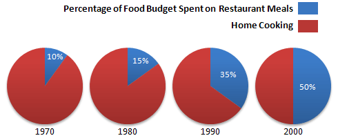
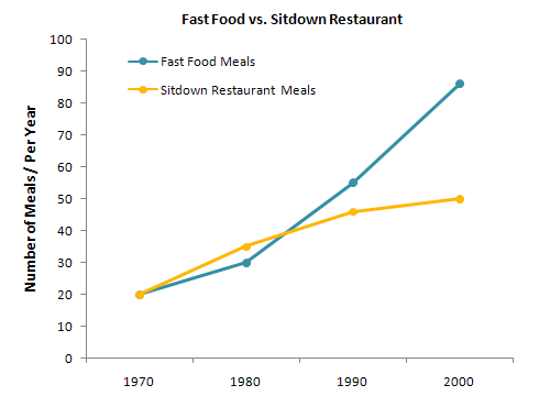
Over the past 30 years, the average family has dramatically increased the number of meals that they eat at restaurants. The percentage of the family's food budget spent on restaurant meals steadily climbed. Just 10 percent of the food budget was spent on restaurant meals in 1970, and 15 percent in 1980. That percentage more than doubled in 1990, to 35 percent, and rose again in 2000 to 50 percent.
…… …… 余下全文
篇四 :英语写作——图表类写作
书面表达讲解与训练——图表类写作
一. 教学内容:
书面表达讲解与训练——图表类写作
[如何写图表作文]
图表作文多以说明文和议论文为主,要求考生根据所给的图表、数据及标题进行分析、研究,阅读其中的文字和说明,弄清各种信息之间的关系,提炼和确定出文章的中心思想。
然后进行分析、概括和归纳。注意:1)图表和数据内容不必全部描述。2)善于抓住总的规律,趋势,归纳增减率。 3)时态:特定时间用过去时。经常出现的情况或自己的评述用一般现在时。
[图表作文形式有]
数字表:曲线图(line graph) 表格 (table)
图形表:饼状图(pie chart) 条状图(bar chart)
…… …… 余下全文
篇五 :英语图表作文模板
图表描述专题训练(一)
这类作文时,注意以下几点:
第一,审题时,除了要把握好图表的表层信息外, 还要分析图标的深层含义,如原因、根源、可能的发展趋势等。图表中所提供的说明文字往往是问题的切入点,一定要仔细分析。
第二,描述数据时要抓住重点,为中心服务,不必面面俱到,切忌毫无目的地罗列图表中的数据。如果数据较多,抓住图表中的极端点(如最大或最小、最多或最少,最好或最差)和基本相同进行描述。
第三,主题句应明确,最好放在文章的开头,这样会使重点突出,主题明了。
图表范例一
Students Use of Computers

例文: Students Use of Computers
提纲: 1. 上图所示为某校大学生平均每周使用计算机的时间: 1990年(2 hours), 1995年 (4 hours), 20##年 (14 hours),请描述其变化;
2. 请说明发生这些变化的原因(可从计算机的用途、价格或社会发展等方面加以说明);
3. 你认为目前大学生在计算机使用中有什么困难或问题。
…… …… 余下全文
篇六 :英语图表作文范文
英语图表作文范文
日用花销统计
Statistics in People's Daily Expenses in Xi'an
YearItem 1995 1996 1997 1998 1999
Food 66% 61% 48% 41% 36%
Clothing 9% 10% 12% 15% 18%
Recreation 4% 5% 8% 9% 11%
[2.图画/图表描述段]What is shown in the table above indicates that dramatic changes have taken place in the daily expenses in Xi' an from 1995 to 1999. The expenses on food have declined by 30% while those on clothing and recreation have increased respectively by 9% and 7%. The statistics of rise and fall seem to exist in isolation but closely related to one another.
…… …… 余下全文
篇七 :英语作文图表类提纲类作文写作模板
第一部分、写作模板——图表式作文
It is obvious in the graphic/table that the rate/number/amount of Y has undergone dramatic changes. It has gone up/grown/fallen/dropped considerably in recent years (as X varies). At the point of X1, Y reaches its peak of …(多少).
What is the reason for this change? Mainly there are … (多少) reasons behind the situation reflected in the graphic/table. First of all, …(第一个原因). More importantly, …(第二个原因). Most important of all, …(第三个原因).
From the above discussions, we have enough reason to predict what will happen in the near future. The trend described in the graphic/table will continue for quite a long time (if necessary measures are not taken括号里的使用于那些不太好的变化趋势).
…… …… 余下全文
篇八 :英语图表作文范文
人口增长对野生动物的影响(99年真题)
[2.图画/图表描述段] From these graphs, we can draw a conclusion that, with the growth of human population, the number of species has decreased rapidly in America, and some species have even vanished from our planet.
[6.原因列军段]Why does this phenomenon appear? There are several possible reasons for this. Above all, as the human population grows rapidly, a growing number of people came to live where some wild species have been living. Then these species have to move to other places. Some of them probably can not adapt to the new environment and die. In addition, although many people look on the wildlife as their friends, some people may not think so. They catch a lot of wild animals and sell them in order to get more money. Even worse(坏)/More importantly(好), as the result(中性) /consequence(贬义)of the industry, the natural balance and the ecologic environment are destroyed. The clear cutting has become increasingly serious. So some of the wildlife become homeless and extinct.
…… …… 余下全文