图表作文例文
图表作文第一段
例1
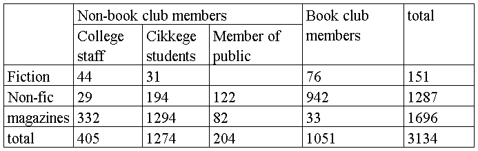
the table below summarises some data collected by a college bookshop for the month of February 1998.
例文
the table describes some sales figures gathered by a college bookstore for February, 1998.
we can see from the table that the non-book club member figures are made up of sales to college staff, college students and members of the public. more specifically, college staff bought 332 magazines, 44 fiction and 29 non-fiction books while college students bought 1249 magazines, 194 non-fiction books and 31 fiction books. more magazines were sold to college students than any other group of customers. in contrast, although non-fiction books were sold to members of the public, they bought 122 non-fiction books and 82 magazines.
例2.
The graph below shows the number of people at a London underground station from 6:00 to 22:00. Summarise the information by selecting and reporting the main features, and make comparisons where relevant.
图表上课画在黑板上。
The line graph illustrates the data about people at a London subway station from 6 am to 10 pm.
As we can see from the line graph, the number of people using this station fluctuates over these 16 hours. More specifically, at first at 6am the number of people at the station stands at only 100. Then, the number shoots up over the next two hours, peaking at 400 at 8am. After that, the number declines rapidly for two hours, bottoming out at 180 at 10am. The period between 10 o’clock and 12 o’clock experiences a slight growth in the number of people in the station, with the number reaching 280 at midday. Numbers in the following two hours level off at just under 300people. From this point onwards, the number plunges to only 100 from 2pm to 4pm. The next 2 hours experiences a sharp rise again, with 6 pm arriving at 380 people. After 6pm, the number falls again, reaching the low point of 130 at 8pm. The period from 8pm to 10pm sees a slight rise, but finally the number of people declines again from 180 at 9pm to 135 at 10pm.
第二篇:图表作文:句型,范文
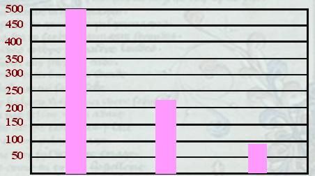
Write a composition entitled “Causes of Fires” based on the following graph.
Number of Fires
Smoking Defective Insulation children Playing With matches
Your composition should be in three paragraphs:
1) introduce the causes;
2) report the information given in the graph;
3) conclude the composition by giving some suggestions
范文:sample
Causes of Fires
In spite of all the progress that mankind has made over years, fire continues to be a terrible killer in our modern society. From the graph, which depicts the leading causes of fires, we can see that most fires are caused by smoking, defective insulation and children playing with matches. The graph makes it clear that smoking was responsible for most of the fires, namely about 500 of them. Defective insulation resulted in more than 200 fires and children playing with matches caused nearly 100 fires. These results indicate that smoking can thus be regarded as the enemy of the whole society, especially when the public interest is taken into consideration.
From the above, we can see that smoking is the leading cause of fires. Therefore we should remind smokers to pay close attention to their cigarette ends when they smoke. On the other hand, we should also educate our children, warning them of the danger of playing with matches. It’s time for us to take measures to prevent dangerous fires.
图表作文的常用句型、词汇:
The following are some useful expressions in graph writing,Find more by yourself in your reference books of writing direction or on line
1) The picture shows…
2) This table shows the differences between…
3) The diagram represents…
4) The chart above indicates…
5) The information represented in the graph indicates…
6) As can be seen from the chart, …
7) As is shown in the bar graph, there were…
8) From the diagram it can be seen clearly that…
9) From these figures one can easily see that…
10) According to the graph given above, we can see that…
11) This is an illustration of…/a typical example of…
12) There was a great/slight increase/rise.
13) There has been a sudden/slow/rapid fall/drop…
14) Take the above chart as an example,…
更多还有:
The table (diagram/ graph / chart /bar柱形/ pie饼图 / chart/ curve曲线) presents ( shows ) the data ( statistics 统计/ figures 数据) about…
The above data ( statistics / figures) can be interpreted as follows
As is shown in the table that
From the data presented in the table we can conclude that
The data show/ suggest / prove that
compared with
in relation to …
double / triple / half the number/ percentage of
three times/ twice as high /large/many as…
There was a very minimal ( slight / sudden / slow / dramatic显著 / steady平稳 / steep / gradual/ large / rapid / sharp / small / marked 明显) drop (decline / fall / reduction / decrease / fluctuation波动 / increase / rise )
The average age of the children is 10
A is ( makes up / occupies / accounts for ) 占 …% of the total population / expenditure the total comes to (amounts to )…总计
本单元作文题:
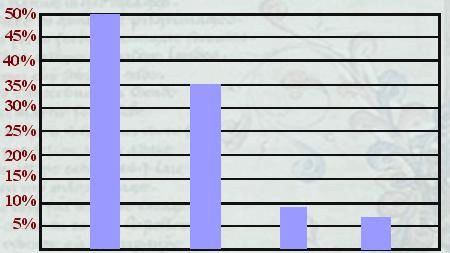
Write a composition entitled “Leading Causes of Road Accidents in China”. The composition should be based on the following graph.
Percentage of Accidents
Motor Vehicles Bicycles Pedestrians Others
Your composition should be in three paragraphs
1) introduce the causes;
2) report the information given in the graph;
3) conclude the composition by giving some suggestions
-
图表作文经典用词总结
图表作文经典用词总结。审题、读图、概述、原因分析、预测未来Introduction—Body--Conclusion描述图表内容:…
-
英语学习_英语图表作文_必备
弃我去者,昨日之日不可留乱我心者,今日之日多烦忧简介图表作文是考研英语写作中较为常见的题型之一,也是难度较大的一种写作题型。这类作…
-
Egcfmqy英语图表作文
生命是永恒不断的创造,因为在它内部蕴含着过剩的精力,它不断流溢,越出时间和空间的界限,它不停地追求,以形形色色的自我表现的形式表现…
-
帮助大家更好准备英语四六级图表作文
帮助大家更好准备英语四六级图表作文,现给大家提供“英语六级考试图表作文的常用词”总结,希望对你们考试有帮助!1.有用的词上升:in…
-
雅思写作基础教材——图表作文部分小结
雅思写作基础教材——图表作文部分小结Piechart1、对题目的改写部分asapercentageof整体Thepiechartg…
-
20xx高职高专写作大赛图表作文讲解及参考范文
英语四级图表作文讲解及参考范文图表作文也是四六级考试中常见而且被认为是一种较难的作文形式图表作文就是把非文字信息通常为各种图表表示…
-
英语四级记叙文写作
英语四级记叙文写作第一部分记叙文题型作文写作步骤要求考生写一篇记叙文描述事件发生的时间地点原因人物及结果最后对事件进行简单分析如2…
-
中考英语作文范文-图表说明文
中考英语作文英语作文模板图表作文的框架asisshownindicatedillustratedbythefigurepercen…
-
20xx年深圳市中考英语作文题目预测及范文
20xx年中考英语作文题目预测及范文一假如你是一所国际学校校办英文杂志的学生编辑你看了下面这封信后也想写一篇关于该信的读后感内容要…
-
考研英语二 图表类作文
鲤鱼网图表作文一第一节图表作文的类型图表作文可分为两大类表作文和图作文表作文表格Table可以使大量数据系统化便于阅读比较表格常由…
- 图表作文是考研英语写作中较为常见的题型之一