英语图表作文范例
六.图表分析法
图表作文要求学生首先看懂图表展示的内容,然后用图标中的数据作为论据对主题进行讨论,最后得出合乎情理的结论。
描述图表时常用的词语如下:
1)表示各种图表
Table 表格
Chart 曲线图
Line graph 线条图
Bar chart 条形图
Pie chart 饼形图
2)表示 “如图所示”
According to the table…
As (is) shown/indicated/ illustrated in the chart…
The line graph shows/ indicates /illustrateds that…
3) 表示时间跨度
From 1990 to 1999
Over the period from 1981 to 2001
During the past three decades
Between 1998 and 2001
4) 表示“上升”
Increase / rise / go up
5) 表示 “下降”
Decrease / fall/ go down
6) 表示 “上升/下降到…
To
7) 表示“ 上升/下降了…
By
8) 表示“呈上升趋势”
On the rise/ increase
Tend to go up/ rise /increase
9) 表示“呈下降趋势”
On the decline
Tend to go dwon/ decrease / fall
10) 表示 “在数量或比例方面占”
Account for / make up
Girls account for / make up 60% of our class.
Notice :
图表中所给的数据一般都比较多,要抓住主要信息并加以描述。可以做首尾比较,即把时间最早的与时间最晚的信息作比较。也可以做极值比较,即把最高点与最低点作比较。图表中所给出的各种信息类别都要提到,但不一定要把每个数据都提到,甚至连一个数据不提都可以,但至少要做一个总的陈述。
【例1】
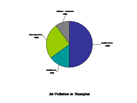
Air Pollution in Shanghai
With the development of industry, a serious problem, air pollution arises. In Shanghai many people have come down to illness due to air pollution.
Recently, a study shows that there are many causes that account for the problem. As illustrated in the pie chart, the major one is caused by vehicles( 50%). Today there are many vehicles on the roads. Thus, there is a large amount of automobile exhaust. Factories are also responsible for air pollution (20%). They give off poisonous gases. Another factor that cannot be neglected is smokers (15%). Smoking not only does harm to the smokers but also to others. It will lead to lung cancer. There are other causes that contribute to air pollution, too. (10%)
If this situation goes on, air pollution may be more and more serious in Shanghai. Therefore, some drastic measures should be taken. First of all, new fuel without pollution must be used to replace gasoline. It is the most efficient way to solve the problem. Second, people must realize the problem of air pollution and do their best to alleviate the problem. Finally, more trees should be planted and existing trees should be protected from being cut.
These are not the only three measures we can take, but it should be noted that everyone should be aware of creating a clean environment.
【例2】
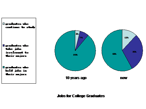
Jobs for college graduates recently have been brought into focus. As is shown in the two charts, a striking contrast can be found. The number of graduates who take jobs irrelevant to their majors rise dramatically. Furthermore, the number of graduates who continue to study is also growing. As a result, the number of graduates who hold jobs in their majors decreases relatively.
There are two main reasons for this phenomenon. For one thing, the major channel for us students to acquire knowledge is from books. However, the books that are used in colleges are out of date. What’s more, many students can’t put theories into practice; namely, they can’t make use of their knowledge to deal with practical problems. For another, there are too many college students who study hot majors, but society cannot offer so many jobs related to majors.
The above analysis can lead us to the conclusion that college students must try to meet the needs of the job market if they want to find a suitable job.
第二篇:英语图表作文范例
英语图表作文范例
一、图表作文写作常识
1、图形种类及概述法:
泛指一份数据图表:a data graph/chart/diagram/illustration/table
饼图:pie chart
直方图或柱形图:bar chart / histogram
趋势曲线图:line chart / curve diagram
表格图:table
流程图或过程图:flow chart / sequence diagram
程序图:processing/procedures diagram
2、常用的描述用法
The table/chart diagram/graph shows (that)
According to the table/chart diagram/graph
As (is) shown in the table/chart diagram/graph
As can be seen from the table/chart/diagram/graph/figures,
figures/statistics shows (that)……
It can be seen from the figures/statistics
We can see from the figures/statistics
It is clear from the figures/statistics
It is apparent from the figures/statistics
table/chart/diagram/graph figures (that) ……
table/chart/diagram/graph shows/describes/illustrates how……
3、图表中的数据(Data)具体表达法
数据(Data)在某一个时间段固定不变:fixed in time
在一系列的时间段中转变:changes over time
持续变化的data在不同情况下:
增加:increase / raise / rise / go up ……
减少:decrease / grow down / drop / fall ……
波动:fluctuate / rebound / undulate / wave ……
稳定:remain stable / stabilize / level off ……
最常用的两种表达法:
动词+副词形式(Verb+Adverb form)
形容词+名词形式(Adjective+Noun form)
二、相关常用词组
1、主章开头
图表类型:table、chart、diagramgraph、column chart、pie graph
描述:show、describe、illustrate、can be seen from、clear、apparent、reveal、represent
内容:figure、statistic、number、percentage、proportion
2、表示数据变化的单词或者词组
rapid/rapidly 迅速的,飞快的,险峻的
dramatic/dramatically 戏剧性的,生动的
significant/significantly 有意义的,重大的,重要的
sharp/sharply 锐利的,明显的,急剧的
steep/steeply 急剧升降的
steady/steadily 稳固的,坚定不移的
gradual/gradually 渐进的,逐渐的
slow/slowly 缓慢的,不活跃的
slight/slightly 轻微的、略微地
stable/stably 稳定的
3、其它在描述中的常用到的词
significant changes 图中一些较大变化
noticeable trend 明显趋势
during the same period 在同一时期
grow/grew 增长
distribute 分布,区别
unequally 不相等地
in the case of adv. 在……的情况下
in terms of / in respect of / regarding 在……方面
in contrast 相反,大不相同
government policy 政府政策
market forces 市场规率
measure n.尺寸,方法,措施v.估量,调节
forecast n.先见,预见v.预测
三、考研英语图表写作套句精选
1.the table shows the changes in the number of……over the period from……to……
该表格描述了在……年之……年间……数量的变化。
2.the bar chart illustrates that……
该柱状图展示了……
3.the graph provides some interesting data regarding……
该图为我们提供了有关……有趣数据。
4.the diagram shows (that)……
该图向我们展示了……
5.the pie graph depicts (that)……
该圆形图揭示了……
6.this is a cure graph which describes the trend of……
这个曲线图描述了……的趋势。
7.the figures/statistics show (that)……
数据(字)表明……
8.the tree diagram reveals how……
该树型图向我们揭示了如何……
9.the data/statistics show (that)……
该数据(字)可以这样理解……
10.the data/statistics/figures lead us to the conclusion that……
这些数据资料令我们得出结论……
11.as is shown/demonstrated/exhibited in the diagram/graph/chart/table……
如图所示……
12.according to the chart/figures……
根据这些表(数字)……
13.as is shown in the table……
如表格所示……
14.as can be seen from the diagram,great changes have taken place in……
从图中可以看出,……发生了巨大变化。
15.from the table/chart/diagram/figure,we can see clearly that……or it is clear/apparent from the chart that……
从图表我们可以很清楚(明显)看到……
16.this is a graph which illustrates……
这个图表向我们展示了……
17.this table shows the changing proportion of a & b from……to……
该表格描述了……年到……年间a与b的比例关系。
18.the graph,presented in a pie chart, shows the general trend in……
该图以圆形图形式描述了……总的趋势。
19.this is a column chart showing……
这是个柱型图,描述了……
20.as can be seen from the graph,the two curves show the flutuation of……
如图所示,两条曲线描述了……的波动情况。
21.over the period from……to……the……remained level.
在……至……期间,……基本不变。
22.in the year between……and……
在……年到……期间……
23.in the 3 years spanning from 1995 through 1998……
1995年至1998三年里……
24.from then on/from this time onwards……
从那时起……
25.the number of……remained steady/stable from (month/year) to (month/year)。
……月(年)至……月(年)……的数量基本不变。
26.the number sharply went up to……
数字急剧上升至……
27.the percentage of……stayed the same between……and……
……至……期间……的比率维持不变。
28.the figures peaked at……in(month/year)
……的数目在……月(年)达到顶点,为……
29.the percentage remained steady at……
比率维持在……
30.the percentage of……is sightly larger/smaller than that of……
……的比例比……的比例略高(低)。
31.there is not a great deal of difference between……and……
……与……的区别不大。
32.the graphs show a threefold increase in the number of……
该图表表明……的数目增长了三倍。
33……decreased year by year while……increased steadily.
……逐年减少,而……逐步上升。
34.the situation reached a peak(a high point at) of[%].
……的情况(局势)到达顶(高)点,为……百分点。
35.the figures/situation bottomed out in……
数字(情况)在……达到底部。
36.the figures reached the bottom/a low point/hit a trough.
数字(情况)达到底部(低谷)。
37.a is ……times as much/many as b.
a是b的……倍。
38.a increased by……
a增长了……
39.a increased to……
a增长到……
40.high/low/great/small/ percentage.
比低高(低)
41.there is an upward trend in the number of……
……数字呈上升趋势。
42.a considerable increase/decrease occurred from……to……
……到……发生急剧上升。
43.from……to……the rate of decrease slow down.
从……到……,下降速率减慢。
44.from this year on,there was a gradual declinel reduction in the……,reaching a figure of……
从这年起,……逐渐下降至……
45.be similar to……
与……相似
46.be the same as……
与……相同
47.there are a lot similarities/differences between……and……
……与……之间有许多相似(不同)之处
48.a has something in common with b
a于b有共同之处。
49.the difference between a and b lies in……
a与b之间的差别在于……
50……(year)witnessed/saw a sharp rise in……
……年……急剧上升
一、 图表作文的类型
二、 图表作文的出题形式
三、 图表作文的写作要领
四、 图表作文练习及其参考范文
图表作文也是四(六)级考试中常见,而且被认为是一种较难的作文形式。图表作文就是把非文字信息(通常为各种图表表示的数字信息等)转换成文字信息的一种作文。它要求我们用文字来描述非文字性的图表或对图表显示的关系作解释说明。下面我们先来看一看图表作文的类型。
第一节 图表作文的类型
图表作文可分为两大类:表作文和图作文。
图表作文
表格(Table)可以使大量数据系统化,便于阅读、比较。表格常由标题(Title)、表头(Boxhead)(表格的第一行)、侧目(Stub)(表格左边的第一列)和主体(Body)部分(表格的其余部分)等部分组成。如下表:
用表格表达的信息具体准确,而且表格中的各项均按一定规律排列。阅读表格时要注意找出表格中各个项目的相互关系,表格中各个项目的变化规律。例如,上面的表格中的数字说明,和1978年相比,1983年大学入学的人数在增加,而小学的入学人数在减少。搞清楚这些变化规律也就读懂了表格的内容。
图作文
图作文又可分为三种:圆形图作文、曲线图作文和条状图作文。
(1) 圆形图作文
圆形图(Pie chart)也称为饼状图或圆面分割图。圆形图因为比较形象和直观,各部分空间大小差别容易分辨,所以常用来表示总量和各分量之间的百分比关系。整个圆表示总量,楔形块表示分量。有时圆形图还有数值表,两者结合可把各分量表示得更准确、清楚。例如:
This is a pie chart of the average weekly expenditure of a family in Great Britain. As can be seen from the chart, the main expenditure of an average British family is spent on food, which accounts for 25% of its total expenditure. The next two significant expending items are transport and housing, which are 15% and 12% respectively. If we take into account clothing and footwear, which makes up 10%, the four essentials of life, that is, food, transport, housing, and clothing and footwear, amount to 62% of the total expenditure.
(2) 曲线图作文
曲线图(Line graph)也称为线性图或坐标图。曲线图最适合表示两个变量之间关系的发展过程和趋势。一般来说,曲线所呈现的形状比某一点所代表的变量的值更有意义。曲线图有横轴和纵轴。一般先看横轴所代表的数量或时间等,然后再看纵轴所显示的意义。同时必须找出线条所反映的最高或最低的变化。例如:
这个曲线图的横轴代表1990年的不同的月份,纵轴代表交通事故的数量。从交通事故曲线图上可知,前八个月的交通事故的数量有升有降。曲线图在八月份升到了最高点(39),此后一直呈下降的趋势,十二月份降到了最低点(16)。可见,1990年的交通事故的数量总体上呈下降的趋势。
(3) 条形图作文
条形图(Bar graph)也称为立柱图或圆柱图。条形图由宽度相同但长度不同的条块代表不同的量。当要比较几个项目或量时,常用不同颜色来区分。条形图主要用来表示:1)同一项目在不同时间的量;2)同一时间不同项目的量。阅读条形图时,要先看图例,再看横轴、纵横各代表什么量,每一个刻度所代表的值是多少,最后找出图中各长条所表示的数据及各长条间的相互关系。例如:
左边的条形图的横轴代表时间,纵轴代表期望寿命(Life Expectancy),这一条形图想要体现的是同一项目(期望寿命)在不同时间的量。右边的条形图的横轴也是代表时间,纵轴是代表婴儿的死亡率(Infant Mortality),这一条形图想要体现的也是同一项目(婴儿的死亡率)在不同时间的量。左边的条形图表明1990年的人均期望寿命比1960年的人均期望寿命长20岁,而1990年的婴儿死亡率比1960年的婴儿死亡率下降了50%。
第二节 图表作文的出题形式
我们先来看几个四(六)级考试中的图表作文的例子。
例1 题目:Changes in People’s Diet (1991年6月四级试题)
Study the following table carefully and your composition must be based on the information given in the table. Write three paragraphs to :
1. state the changes in people’s diet (饮食) in the past five years;
2. give possible reasons for the changes;
3. draw your own conclusions.
You should quote as few figures as possible.
例2 题目:Car Accidents Declining in Walton City (1991年6月6级试题)
Remember that your composition must be written according to the following outline;
1. Rise and fall of the rate of car accidents as indicated by the graph;
2. Possible reason(s) for the decline of car accidents in the city;
3. Your predictions of what will happen this year.
Your composition should be no less than 120 words and you should quote as few figures as possible.
例3 For this part, you are allowed 30 minutes to write a composition on the topic Health Gain in Developing Countries. Your composition must be no less than 120 words and you should base your composition on the following instructions (given in Chinese):
1. 以下图为依据描述发展中国家的期望寿命(life expectancy)和婴儿死亡率(infant mortality)的变化情况
2. 说明引起变化的各种原因
从以上例子可见,图表作文一般在题目中给出作文的标题和一个或几个统计表格、圆形图、曲线图或条形图,有时还用英文或中文提纲的形式给出提示,要求我们:1)用文字描述图表,客观解释图表中所传递的信息,并找出某种规律或趋势;2)就图表中所反映的某种趋势或问题分析其原因或后果。
第三节 图表作文的写作要领
图表作文着重说明事实,常常是通过对图表中所反映的具体数据的说明、分析、比较,对某种事物或现象的事实或变化情况等加以说明,并提出结论或看法。因此,图表作文常常采用议论文体的写作方法。
写好图表作文,关键在于能否读懂图表中所提供的信息,把握各信息间的联系,用准确流畅的语言把这一信息表达出来,并就这一信息发表自己的看法。
图表作文的写作步骤
写图表作文时,要注意遵循以下步骤:
1)认真分析图表的含义,弄清图表中所含的信息及不同信息间的关系;
2)确定文章的主题思想,构思出文章的基本框架,筛选出能说明图表主题思想的典型数据;
3)编列文章的提纲;
4)根据文章的提纲,将各段的提纲内容扩展成段落,然后将各个段落组成文章,注意段与段之间的衔接与过渡;
5)检查与修改。
图表作文的篇章结构
写图表作文时,常采用三段式的谋篇方式。文章的第一段往往分析图表中的数据变化反映什么问题或趋势,概述图表所揭示的信息。第二段分析造成这一问题或趋势的原因。第三段则展望未来的情况或提出解决问题的办法或建议。这一结构可以简单地表述为:
第一段:概述图表反映的主题思想
第二段:分析产生的原因
第三段:展望未来或提出方法或建议
图表作文常用的句型
(1)常用的开篇句型(即概述图表内容时常用的表达法)
① According to the table/pie chart/line graph/bar graph, we can see/conclude that … 根据该表/图,我们可知 ……
② The table/graph reveals (shows/indicates/illustrates/ represents/points out) that … 该表/图表明……
③ As we can see from the table …
As can be seen from the line/bar graph …
As is shown (illustrated/indicated) in the pie chart …
如表/图所示,……
(2) 描述增减变化常用的句型
① Compared with … is still increased by …
② The number of … grew/rose from … to …
③ An increase is shown in …; then came a sharp increase of …
④ In … the number remains the same/drops to …
⑤ There was a very slight (small/slow/gradual) rise/increase in 1990.
⑥ There was a very steady (marked/sharp/rapid/sudden/ dramatic) drop (decrease/decline/fall/reduction) in 1998/ compared with that of last year).
好,下面我们来看一篇根据例2的题目要求写的范文。
⑴From the graph, we can see that the number of car accidents in Walton city fluctuated during the year of 1990. ⑵The first two months of 1990 showed an increasing trend. ⑶The rate rose to 32 in March but fell to 26 in June. ⑷From June on, the rate was rising again and reached the peak point 39 in August. ⑸After August the rate began to decline remarkably, and eventually dropped to the lowest point 16 at the end of the year. ⑹Therefore, it’s obvious that car accident in Walton city declined in 1990.⑴主题句/概述表格反映的内容⑵—(5)反映交通事故的变化情况(6)小结:总结表格数据反映的总趋势
⑺There are several reasons for the decline. ⑻First, a new traffic law was made and came into force. ⑼It provided that in summer every car must be air-conditioned. ⑽As a result, the highest rate in August, when humidity and high temperature make drivers impatient and easily lead to car accidents, dropped steadily. ⑾Second, new roads were built and some narrow streets were widened, which quickened the flow of traffic. ⑿Finally, the city administration made great efforts to heighten people’s awareness of observing traffic rules.⑺主题句⑻原因/措施一⑼解释措施一/次要辅助⑽采取措施一后的结果⑾原因/措施二⑿原因/措施三
⒀With all these new measures, I’m sure the rate of car accidents in Walton city will go on falling this year.⒀总结:展望未来的情况
小结:这一讲我主要讲了图表作文的类型、出题形式及其写作要领。
下面我们进行写作练习。我将给大家一个作文题,请大家根据这一讲的内容,在30分钟内完成。大家在写作的过程中要注意审题,考虑文章的结构、采用的扩展方法、开头的结尾的方法以及文章中的过渡等。
练习四:
Directions: For this part, you are allowed thirty minutes to write a composition of no less than 120 words on Changes in People’s Diet. Study the following table carefully and your composition must be based on the information given in the table. Write three paragraphs to:
1. state the changes in people’s diet (饮食) in the past five years;
2. give possible reasons for the changes;
3. draw your own conclusions.
You should quote as few figures as possible.
⑴As is shown in the table, there have been great changes in people's diet between 1986 and 1990. ⑵From the table, we can find that grain, formerly the main food of most Chinese people, is now playing a less important role in people's diet. ⑶And the same goes for fruit and vegetables. ⑷On the other hand, the consumption of high-nutrition food such milk and meat has increased rapidly.
⑸What has caused these changes? There are mainly three reasons (主题句). (6) First, people are much wealthier than before. (7) With higher income, they can afford to buy nutritious foods. (8) Second, people have realized the importance of a balanced diet to their health. (9) Lack of certain amount of meat or milk, for example, will result in poor health. (10) Finally, owing to the economic reform, meat and milk, which were scarce in the past, are produced in large quantities.
(11) Although milk and meat are important to one's health, eating too much rich food may result in obesity and may other diseases. (12)Therefore, people should not only eat a lot of milk and meat, but also enough grain, fruit and vegetable for the sake of their health.
-
英语图表作文范例
六图表分析法图表作文要求学生首先看懂图表展示的内容然后用图标中的数据作为论据对主题进行讨论最后得出合乎情理的结论描述图表时常用的词…
-
英语图表作文范文
HowPeopleSpentTheirHolidaysAscanbeseenfromthetablethepastdecadehavewitnesse…
-
英语四级图表作文讲解及参考范文
英语四级图表作文讲解及参考范文图表作文也是四六级考试中常见而且被认为是一种较难的作文形式图表作文就是把非文字信息通常为各种图表表示…
-
英语图表作文范文
1Thechartsbelowshowthepercentageoftheirfoodbudgettheaveragefamilyspentonres…
-
英语图表作文范文
人口增长对野生动物的影响99年真题2图画图表描述段Fromthesegraphswecandrawaconclusionthatw…
-
雅思小作文饼状图写作范例、思路、常用句式
雅思小作文饼状图一例Manywomenwantorneedtocontinueworkingaftertheyhavechildr…
-
雅思小作文饼状图范文
刚刚结束的12月21日雅思考试中小作文考到了柱状图和饼状图很多同学对于饼状图的写作并不是很有把握让我们一起来看看上海环球雅思写作老…
-
英语四级图表作文的类型及范文
英语四级图表作文的类型及范文一图表作文的类型二图表作文的出题形式三图表作文的写作要领四图表作文练习及其参考范文图表作文也是四六级考…
-
英语图表作文
简介图表作文是考研英语写作中较为常见的题型之一也是难度较大的一种写作题型这类作文可综合提供题目数据图像提纲形式多样但实际上只涉及5…
-
雅思写作Task1饼状图考官范文(3)
最权威的国际教育服务平台雅思写作Task1饼状图考官范文3本文为大家收集整理了雅思写作Task1饼状图考官范文3认真研读一定的雅思…
-
中考英语作文范文-图表说明文
中考英语作文英语作文模板图表作文的框架asisshownindicatedillustratedbythefigurepercen…