雅思写作 饼图范文
A glance at the two pie charts provided reveals the relative popularity of various leisure activities among European adults in 1985 and 1995.
Of these activities, watching television was the most widely enjoyed in both years, at 32 percent in 1985 and a slightly lower 30 percent in 1995. Yet, by far the most significant change to take place during the period was the increased popularity of computer games. Not a single respondent to the survey rated playing computer games as their preferred activity in 1985. However, by 1995 this figure stood at 27 percent - the second highest overall. Also more popular in 1995 was talking with friends, at 26 percent compared to 21 percent a decade earlier.
In stark contrast, however, all other activities decreased in popularity. Eating out - which was the second most widely enjoyed pastime in 1985, accounting for 23 percent of respondents - slipped to a mere 8 percent in 1995. Likewise, there were
also considerable decreases in the popularity ratings of talking with family, other activities and (as previously mentioned) watching television.
第二篇:句型套路让“饼图”雅思写作华彩绽放(上)
句型套路让“饼图”雅思写作华彩绽放(上)
——广州朗阁雅思新托福
朗阁海外考试研究中心
今天朗阁专家们将结合多年教学经验,对饼图的分析方法、词汇句型和写作套路进行总结和分类,以帮助考生理清写作思路,更准确地回应题目的要求。
饼图是一种以圆形图示的方式将各个项目所占比例和分布情况进行展现和对比的图表,一个饼图通常显示一个数据系列。回看近两年的雅思写作考试,饼图出现的次数有了较大的提升,因此考生应在今后的备考中对其多加留意。
许多考生觉得饼图十分简单,也就是一些百分比及数字的列举,对该类图表不太重视,准备并不充分。笔者根据学生的日常作业来看,很多学生并没能准确把握这一图表的特征。在实际考试中,真题大多是多个饼图结合出现,如果一味地罗列数据照搬词组,不但文章读起来枯燥无味,句式和词汇也缺少变化,是无法得到理想的分数的。那么考生该如何应对饼状图表写作呢?
1. 分析思路
在实际考试中,一般以三到四个饼图出现为主,最多曾出现过六个饼图的组合,但无论如何变化,多饼图一般可分为以下两种模式,笔者将举出一些实例进行分析:
1)无关型饼图

图一
请注意以上三个饼图(图一),它们分别介绍了世界上的不同花费比例,世界人口分布及资源消耗的去向,三个饼图涉及的内容和划分标准不尽相同,不可能将三者结合起来一起论述。
对于这种图表,我们的文章框架架构如下:
Introduction:分别概述三个饼图所说明的信息
如:The three pie charts respectively illustrate some data regarding the distribution in world spending, global population and consumption of resources.
Body:分别说明各饼图的内容,辅以数据(段落层次按照个数划分即可,本题就可以分成三个段落)分别进行排序,稍后详细分析。
Conclusion(选用):说明三个饼图的相关含义,如无,可提炼一下每个饼图最典型的特征(如果已达到要求字数且充分说明内容,结尾段可以略去)
详细来看,世界花费主要支出在食物方面,交通、房产和穿着次之,其他项目合计占到总数的40%;亚洲是世界人口的主要来源地,欧洲、美洲和非洲均占到10%以上,其他地区人口较少。这两个饼图都可以用“排序”的方式来列举数据,具体的写法我们会在下面详细说明。最后一个图表可以用比较的办法突出美国欧洲等发达地区耗费了世界上五分之二的资源。
由于无关型饼图没有什么分类思路可言,句式和词汇会显得相对单一,考生在写作时特别要注意变化,避免单调。
2)相关型饼图
这类饼图组合之间常常有一定关联,只要细心观察不难发现其中的联系点。我们先来看看下面这两个饼图组合:
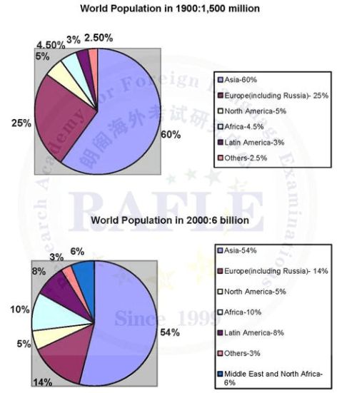
图二
这两个饼图比较了不同年份世界人口的数量及分布情况的变化,数量和分布地区就是我们所找到的两图之间的联系。根据这一思路我们可以将文章架构如下:
Introduction:说明各饼图的联系,此时可以选取如“compare,reveal”之类的动词来突出其关联。
如:The two pie charts reveal the variation in the global population and distribution between 1900 and 2000.
Body:根据各饼图之间的联系,进行分别比较和说明。以本图为例:
1. 数量联系:The world population quadrupled during the past century, from 1.5 to 6 billion.
2. 地区联系:Despite some changes in region distribution, Asia and Europe were still the two areas where the majority of people came from, altogether accounting for over 60% of the total.
当然,一些细节的内容也要详细说明,如其他地区的比例变化有升有降,新统计地区的出现。本图的主线是时间变化,考生可以将其转化成为线图。
Conclusion:相关图表之间一般都有比较明显的联系,可以作为结尾段的总述,如:The majority of people were from Asia and Europe, where a decline in percentage can be found.
再来看看下面这个图表(图三)也是一个相同的例子:
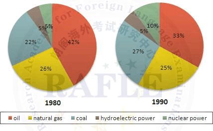
图三
图三主要比较了十年间人们所选用能源的变化,和图二的思路基本相同,也是以时间为主线进行对比,我们可以根据比例的变化方式进行分类:
比例上升:There was a minimal growth in the proportion of coal and nuclear power, with the former from 22% in 1980 to 27% in 1990 and the latter 5% to 10% over the same course.
比例下降:An opposite change can be seen in the percentage of natural gas, oil and hydroelectric power.
值得注意的是,石油一直是人们依赖的主要能源。
我们再来看另外一种相关型图表(图四):
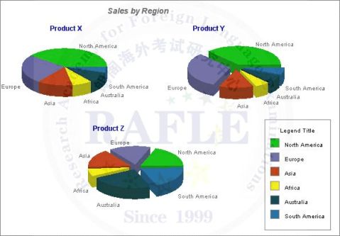
图四
此类图表不是以时间为走向的,而是比较了不同产品在不同地区的市场份额。虽然产品有差异,但地区的分类是一致的。我们的基本思路是观察各图表之间的异同,进行归类。
Introduction:说明各饼图的联系,如:The three pie charts compare the market share of three products in some areas including North America, Europe, Asia, Africa, Australia and South America.
Body:根据各饼图之间的联系,进行分别比较和说明。以本图为例:
1. 相同点:A similar pattern can be found in the distribution of sales for Product X and Y. 两者的排序是一致的
2. 不同点:和Product X和Y相比,Product Z的市场分布比较均匀。 Conclusion:总结异同点即可。
朗阁海外考试研究中心分析认为,相关型饼图的分析思路关键在于找出图表之间的关系,特别是联系点及分类点,前者常见的有时间变化、类别对比;后者常见的有地区、不同事物项等。把握好了这些要点,再辅以适当数据进行说明就能轻松化解饼图。
-
雅思大作文写作范文
SomepeoplethinkweshouldkeepallthemoneyweearnandnotpaytaxtothestateTowhatext…
-
雅思作文范文大全
好的东西可惜不是我整理的是一个叫landfish姑娘收集的厉害v105好的东西和大家分享看这个帖子的人肯定比较多大家别冒险背诵了解…
-
雅思小作文范文
IELTS套句式写作大全第一部分TASK1图表写作套句精选1thetableshowsthechangesinthenumbero…
-
雅思小作文技巧及范文
雅思小作文写作技巧及范文一图表类型饼状图直方图或柱形图趋势曲线图表格图流程图或过程图程序图二解题技巧A表格图1横向比较介绍横向各个…
-
雅思写作大作文-政府类范文
雅思写作大作文政府类范文QuestionThebestwayforthegovernmenttosolvetrafficconge…
-
雅思小作文饼图写作技巧总结
雅思小作文饼图写作技巧总结饼图是雅思小作文写作中最常见的一种形式,所以大家在备考雅思小作文写作的时候,一定要准备一些关于饼图的雅思…
-
雅思小作文饼状图写作范例、思路、常用句式
雅思小作文饼状图一例Manywomenwantorneedtocontinueworkingaftertheyhavechildr…
-
雅思小作文范文
IELTS套句式写作大全第一部分TASK1图表写作套句精选1thetableshowsthechangesinthenumbero…
-
雅思小作文范文
IELTS套句式写作大全第一部分TASK1图表写作套句精选1thetableshowsthechangesinthenumbero…
-
雅思小作文范文
IELTS套句式写作大全第一部分TASK1图表写作套句精选1thetableshowsthechangesinthenumbero…
-
【雅思小作文】组合图(曲线图+饼图)写作范例
组合图是雅思小作文里常考的题型之一其写作非常值得我们深入研究现专供一组合图组合图饼图或piechartlinechart写作范例和…