接雅思小作文之线状图如何实现句子连
雅思小作文之线状图如何实现句子连接
1. 如果所描述的线只是“单纯地上升”或“单纯地下降”,采用then, and, then continued its upward/downward trend more +程度副词+to+数字。
【没有连接的句子1】
Water used in agriculture increased gradually to around 1000 km3 by 1950. And then it went up to almost 3000 km3 by the year 2000.
【实现连接的句子1】
Water used in agriculture increased gradually to around 1000 km3 by 1950, then more dramatically to almost 3000 km3 by the year 2000.
Water used in agriculture increased gradually to around 1000 km3 then continued its upward trend more dramatically to 3000 km3.
【没有连接的句子2】
Unemployment rate slowly declined to 200. Then it sharply dropped to 70.
【实现连接的句子2】
Unemployment rate slowly declined to 200 and continued its downward trend more sharply to 70.
Unemployment rate slowly declined to 200, then more sharply to 70.
2. 如果所描述的趋势相反,即先上升后下降,或先下降后上升,也可以是先波动后平稳,或先平稳后再波动,那我们用but实现连贯。
【没有连接的句子3】
Fish consumption increased to 2500 by 1990. After that it decreased to 2000 by 1995.
【实现连接的句子3】
Fish consumption increased to 2500 by 1990 but later decreased to 2000 by 1995.
【没有连接的句子4】
Oil growth fluctuated around 200 in 1990. Then it remained stable in the year 2000
【实现连接的句子4】
Oil growth fluctuated around 200 in 1990 but later remained stable in the year 2000.
3. 为了实现连贯,还可以使用定语从句which was followed by… 或 which led to…
【没有连接的句子5】
There was a decrease to 200 by 1960. Then there was an increase to 500 by 1970.
【实现连接的句子5】
There was a decrease to 200 by 1960 which was followed by an increase to 500 by 1970. There was a decrease to 200 by 1960 which led to an increase to 500 by 1970.
Sam老师 前沿工作室
第二篇:雅思小作文饼状图
You should spend about 20 minutes on this task. Write a report for a university
lecturer describing the information shown below. You should write at least 150 words.
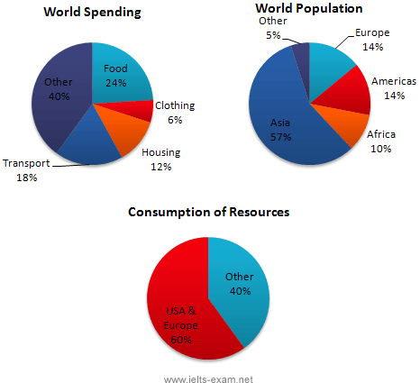
In this analysis we will examine three pie charts. The first one is headed ‘World Spending.’ The second is ‘World Population’ and the third is ‘Consumption of Resources.’
In the first chart we can see that people spend most of their income (24%) on food. In some countries this percentage would obviously be much higher. Transport and then housing are the next major expenses at 18% and 12% respectively. Only 6% of income is spent on clothing.
In the second chart entitled ‘World Population’, it is not surprising to find that 57% of people live in Asia. In fact China and India are two of the most populated countries in the world and they are both situated on this continent. Europe and the Americans account for nearly 30% of the total, whilst 10% of people live in Africa.
Finally, the third chart reveals that the USA and Europe consume a huge 60% of the world’s resource.
To sum up, the major expenditure is on food, the population figures are the highest for Asia and the major consumers are the USA and Europe.
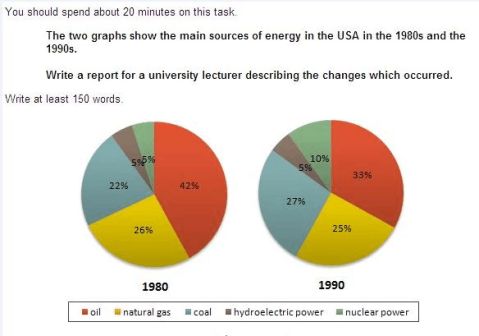
The two graphs show that oil was the major energy source in the USA in both 1980 and 1990.
It is manifest from the pie charts that coal, natural gas and hydroelectric power remained in much the same proportions. On the other hand, there was a dramatic rise in nuclear power, which doubled its percentage over the ten years.
Oil supplied the largest percentage of energy, although the percentage decreased from 42% in 1980 to 33% in 1990. Coal in 1990 was the second largest source of energy, increasing its proportion to 27% from 22% in the previous decade. Natural gas, the second largest source in 1980 at 26%, decreased its share very slightly to provide 25% of America’s energy ten years later. There was no change in the percentage supplied by hydroelectric power which remained at 5% of the total energy used. Nuclear power the greatest change: in 1990 it was 10%, twice that of the 1980s.
占…比例: Occupy account for take part in
剑4 P54 剑8 P53 剑8 p3 剑7 p101
-
小作文1折线图
雅思写作图表作文常用词汇和句型一一雅思图表作文写作常用词汇动词类1表明indicateshowdemonstraterevealg…
-
雅思写作-小作文范文-线图
雅思作文范文女性犯罪率高的原因为帮助大家更好准备雅思考试现在陆续为大家提供雅思作文考试最新真题和范文希望对大家有帮助雅思题目Som…
-
雅思小作文技巧及范文
雅思小作文写作技巧及范文一图表类型饼状图直方图或柱形图趋势曲线图表格图流程图或过程图程序图二解题技巧A表格图1横向比较介绍横向各个…
-
雅思小作文范文
IELTS套句式写作大全第一部分TASK1图表写作套句精选1thetableshowsthechangesinthenumbero…
-
【雅思小作文】组合图(曲线图+饼图)写作范例
组合图是雅思小作文里常考的题型之一其写作非常值得我们深入研究现专供一组合图组合图饼图或piechartlinechart写作范例和…
-
雅思写作-小作文范文-线图
雅思作文范文女性犯罪率高的原因为帮助大家更好准备雅思考试现在陆续为大家提供雅思作文考试最新真题和范文希望对大家有帮助雅思题目Som…
-
【雅思小作文】组合图(曲线图+饼图)写作范例
组合图是雅思小作文里常考的题型之一其写作非常值得我们深入研究现专供一组合图组合图饼图或piechartlinechart写作范例和…
-
雅思写作小作文线形图表题(附范文)
雅思写作LINEGRAPHWRITINGTASK1Test2CambridgeIELTS7Youshouldspendabout2…
-
雅思小作文饼状图范文
刚刚结束的12月21日雅思考试中小作文考到了柱状图和饼状图很多同学对于饼状图的写作并不是很有把握让我们一起来看看上海环球雅思写作老…
-
雅思写作Task1饼状图考官范文(3)
最权威的国际教育服务平台雅思写作Task1饼状图考官范文3本文为大家收集整理了雅思写作Task1饼状图考官范文3认真研读一定的雅思…
-
雅思考试小作文表格,曲线技巧及范文
小作文写作原则1客观不要猜原因不要做预测2准确roughlyapproximately3概括4详尽5多样词汇语法华丽审题步骤题目标…