雅思写作 小作文讲义
Tomoko spends 45 percent of her money on rent and food, but she only spends 25 per cent of her money on study materials==Tomoko spends 45 percent of her money on rent and food, 20 per cent more than the money on study materials.
But: while/however/whereas
3. Tomoko spends more on study materials than she spends on clothes.
Tomoko’s expenditure on clothes is 10% less than that on study materials.
4. Tomoko spends as much money on rent and food as she does on everything else put together. Tomoko spends almost as much money on rent and food as she does on everything else put together.
5. Tomoko spends on rent and food three times as many as entertainment and clothes.
Tomoko spends on rent and food three times as much as on entertainment and clothes respectively.
? The two pie charts show the types of communication used in 1962 and in 1982.
In 1962: P-phone-35%; C-computer-15%; L-letter-50%
In 1982: P-60%; C-30%; L-10%
The percentages exhibited in the two pie charts compare different means of communication used in 1962 and 1982. The three media surveyed are: phone, telephone and letter.
It is apparent from the left pie chart that letter writing was the most popular form of communication in 1962, taking up 50% of the total. However, its use decreased dramatically after that. By 1982, this figure dropped to only 10%, the smallest of that year’s figure.
According to the left chart, we can see that during this same period, the use of phone and computers both increased significantly.
In 1962, the use of the telephone just occupied 35% and the computer was the least used form of the three (15%). In 1982, the telephone, with a percentage of 60%, has become the most used form of communication. Similarly, the use of computers doubled to 30%.
Overall, we can see some important changes in the forms of communication used during the two decades. More and more people appreciate the convenience brought about by the telephone and computer.
曲线图
曲线图的写作要点:
?
?
?
? 注意横竖坐标的单位及意义; 极点说明; 趋势说明; 交点说明;
?
1. 数据的起点
In 1960, the proportion of the 15-46 age group stood at approximately 65%, compared to 30% and 5% of other two age groups.
在描述数据起点的时候,标准的动词词组是stand at, 当然我们还可以使用其他动词来引导,比如begin, start等。
In 1950, world oil discovery stood at 20 million barrels a year.
In 1400, the world population stood at approximately 400 million.
The following curve shows the changes in the number of visitors to London Zoo, Kew Garden and Regent’s Park over the ten-year period from 1978 to 1987.
===
The numbers presented in the line graph compare the numbers of visitors in three different parks in Britain---Regent’s Park, Kew Garden and London Zoo in almost a decade.
From the red line, we can see clearly that _______ remained stable at the level of______ between _______ and _______, then _______to ______ from 1983 to 1984.
By comparison London Zoo _______ between 1978 and the mid-1980, the number of visitors ______ from 54000 to 60000 in _____. Since ____, there had been a __________ in tourists’ ______. From the time onwards there was a ________.
As to Kew Garden, there was a _______ from about 48,000 to the highest point of _______ in _______. Then, __________
In conclusion, both Regent’s Park and London Zoo are the most ______ to which most people would like to.
常用表达:
轻微的增长/下降
稳定的增长/减少
剧烈的增长/降低
数量巨大的增长
轻微的增长到4万/年,然后达到一个平稳的水平
九月到十月期间A的数字保持平稳,大约在5万每年
从20xx年的900人下降到20xx年的500人
曲线图:四条线有三条线都是上升的,一条线是下降的,则三条上升的一起写,也就是说,趋势相同的一起写,那如果三条上升的当中,有两个上升幅度比较大,另外一个比较小,那么两个上升幅度相同的就一起写,就是说程度相同的一起写,这是第一个原则。那除此之外注意趋势间的比较,也就是说,幅度大的和幅度偏小的这样要做一个对比。另外要注意一个比较细节的点就是,线性图定要描述起点、终点以及极值点。
逐渐的/慢慢的/ 轻微的+ 上升/增加/提高
Gradually/slowly/ minimally + Increase/ climb/ rise
剧烈的/ 显著的/ 迅速的/ 数目相当大的 + 上升
Sharply / rapidly/ dramatically / considerable
Soar V. 上升 过去式:soared
leap V.上升 过去式:leapt
下降 drop / fell/ decline / decrease / come down
骤然跌落 plummet = to fall very quickly and suddenly
Dramatic increase---big increase
Significant difference---big difference
Huge drop---go down by a big amount
Little change---to change only slightly
Remained steady/stable---no or very little change over time
Surprising find---something unexpected
The greatest difference occurred
Minor fluctuation---very small changes over time
Steady rise/increase---a gradual change over time
Slight drop/increase/rise/fall/change---a small change
1. In 1990, it increased/decreased from ... to ...
2. By comparison with 1998, it decreased/increased by
with??compared3. The figure has nearly doubled, ?? that of last year. as against??
?increased?4. It has ?? almost ?decreased??two and a half times????twice?, compared with ...
?six times???
?twice???5. The number is ?4 times? as much as that of 1990.
?half???
6. It ? for??accounts? ... percent of the total. (up)??takes
?half?less than????third7. The number was ..., ? a ?? of the 1990 total. ?more than???quarter???
1. As can be seen, from 1940 to the early 1950s, the number of entries to the UK of both countries increased slightly/steadily/sharply/considerably.
2. As can be seen, from 1940 to the early 1950s, the number of entries to the UK of both countries increased slightly to 40,000 per year and then it reached a plateau (高原,稳定水平).
3. As can be seen, from 1940 to the early 1950s, the number of entries to the UK of both countries remained stable/steady at 35,000 per year.
4. As can be seen, from 1940 to the early 1950s, the number of entries to the UK of both countries experienced a upward trend.
5. The number of overseas students at Nankai University decreased _______1000 _____ 1990 _______ 200 ________2000.
6. The number of overseas hamburgers sold at KFC started ________ million in 1995, then it peaked ________ 10 million in 1996 and it finished ______ 2 million.
曲线图作文范例:
图。另附。
These two graphs represent the number of UK citizens traveling and the number of foreign to the UK from 1979 to 1999, and the choices of country for UK residents in 1999.
Generally speaking, the number of oversea visitors traveling to the UK was less than that of UK residents traveling abroad and the favorite country for UK residents was France.
The first graph indicates that the number of UK citizens traveling rose gradually from 12 million in 1979 to 20 million in 1984 and increased steadily from 20 million to 53 million from 1985 to 1999. At the same time, the number of oversea visitors to the UK rose from 10 million in 1979 to 12 million in late 1985 and slowly increased from 12 million to 26 million in 1999.
The second graph suggests that the countries preferred by UK travelers in 1999 were France and Spain at 11.5 million and just fewer than 10 million respectively, both close to Britain. The USA, Greece and Turkey were 3rd, 4th, and 5th with fewer than 4 million UK travelers.
柱状图
Modes of transport and

years
40
5 0
The proportions(比) presented in the bar chart below compare four different means of transport used by city dwellers in a European city in three different years. Those modes are bus, car, bike and foot.
According to the graph, from 1950 to 1990, there was a dramatic increase for city dwellers to use cars to work with 1990 witnessing the highest point at about 37% in the past 40 years. In sharp contrast to it, the number of people chose to cycle or walk to work was on the decrease. From 1950 to 1970, there was a slight drop of cyclists whereas a sharp decrease of people who went to work on foot. However, the figures of bicycle users fell dramatically by 20 % from 1970 to 1990 whereas only a slight fall of about 7% occurred for people walking to work.
During the first 20 years from 1950 to 1970, for people taking bus, the number increased considerably by approximately 7%, from 20% to 27%, then it decreased to about 17%.
In conclusion, more and more city dwellers would like to choose to drive to work but less and less liked the modes of riding bikes to work or going to work on foot.
表格的写作要点:
?
?
?
?
? % of total travelle
rs横向比较; 纵向比较; 横向的最大和最小; 纵向的最大和最小; 找准切入点
The table below provides
statistics showing the aspects of
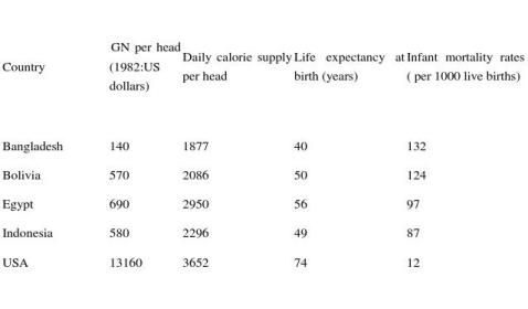
范文一:
USA has the highest GNP and daily calorie intake, the longest life expectancy and the lowest infant mortality rate. In 1982, its GNP was 13160 US dollars, but its infant mortality rate was only 12 per 1000live births.
Egypt, Indonesia, and Bolivia were similar in the four indicators. As a whole, Egypt has the highest quality of life among the three countries. It has the highest figure in three indicators: GNP, daily calorie supply per head and life expectancy. In 1982, its GNP was 690 US dollars, whereas those of Indonesia and Bolivia were 580 and 570 US dollars respectively. However, Indonesia’s infant mortality rate was 87 per 1000, which was slightly lower than that or Egypt (97) and that of Bolivia (124).
Bangladesh has the lowest quality of life in the five countries. Its GNP was 100 times smaller than the USA’s. The biggest in terms of the daily calorie supply per head and life expectancy at birth in Bangladesh were only the half of those respectively in USA. And its infant mortality was 11 times greater.
范文二:
The figures presented in the above table illustrate the living standard in five different nations in 1982 by comparing their four broad economic and life Indicators--- GNP per head; Daily calorie supply per head; Life expectancy at birth (years); Infant mortality rates (per 1000 live births).
These five countries include Bangladesh, Bolivia, Egypt, Indonesia and USA.
It can be seen clearly from the table that USA, the superpower of the world, achieved the highest GNP ($13160 per head) and its people’s average daily calorie intake also ranked the first (3652 per head). Moreover, while the American people enjoyed the longest life expectancy, its infant mortality rate was the lowest. It goes without saying that the USA had the highest level of living.
However, from the figures, we clearly find that the other four developing nations had a considerably lower quality of life in contrast to that of USA. First, there was not much difference in the four broad economic indicators among Egypt, Indonesia and Bolivia. In terms of the first three economic indicators, Egypt seemed to rank the first among the four developing countries, with the GNP per head, Daily calorie supply per head, Life
Expectancy at birth being $690, 2950, 56 years respectively. However, for infant morality rate, it was slightly higher than Indonesia by 10%.
There was another striking contrast between Bangladesh and Bolivia, Egypt, Indonesia and USA. It can be seen clearly from the table that its GNP was only hundredth of the USA’s and that its calorie intake and life expectancy were about half of those in USA. As to infant mortality rate, it ranked the highest.
In summary, from the statistics contained in the table, we can find clearly that there was a far cry between the development of countries in different regions and the gap between them is astonishing.
-
雅思写作-小作文范文-柱状图
柱状图C1T3题目Thechartbelowshowstheamountofmoneyperweekspentonfastfood…
-
雅思小作文范文
IELTS套句式写作大全第一部分TASK1图表写作套句精选1thetableshowsthechangesinthenumbero…
-
雅思小作文技巧及范文
雅思小作文写作技巧及范文一图表类型饼状图直方图或柱形图趋势曲线图表格图流程图或过程图程序图二解题技巧A表格图1横向比较介绍横向各个…
-
雅思小作文组合图范文和写作思路
今天环球雅思为正在备考雅思写作的考生介绍雅思小作文组合图范文和写作思路我们先从雅思小作文组合图范文开始雅思小作文组合图一Write…
-
雅思小作文写作模板
雅思小作文曲线图写作步骤先根据横轴分析变化然后再进行比较第一段介绍核心信息eg时间地点研究对象一句话即可第二三段先分析第一个时间点…
-
雅思table小作文范文总结
Thetablebelowshowstheproportionofdifferentcategoriesoffamilieslivinginpover…
-
雅思作文范文大全
好的东西可惜不是我整理的是一个叫landfish姑娘收集的厉害v105好的东西和大家分享看这个帖子的人肯定比较多大家别冒险背诵了解…
-
雅思小作文范文
IELTS套句式写作大全第一部分TASK1图表写作套句精选1thetableshowsthechangesinthenumbero…
-
雅思大作文写作范文
SomepeoplethinkweshouldkeepallthemoneyweearnandnotpaytaxtothestateTowhatext…
-
雅思小作文技巧及范文
雅思小作文写作技巧及范文一图表类型饼状图直方图或柱形图趋势曲线图表格图流程图或过程图程序图二解题技巧A表格图1横向比较介绍横向各个…